COLDER WIND
Oil Painting Process
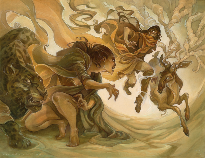
18.5" x 24" Mixed media (acrylic, white charcoal, and oil) on illustration board.
All of my process tutorials are made possible by my patrons on Patreon. Your support helps keep the tutorials coming - you can lend a dollar or two to the cause at the link below!
the concept
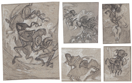
Initial concept thumbnails
This piece was originally born out of an assignment for Illustration Master Class: to create an illustration for Nicola Griffith's shapeshifter tale "Cold Wind." The assignment was open-ended, so I chose to focus on themes of animal transformation (deer and jaguar shape shifters squaring off in the culmination of an eons-old hunt) and creating a sense of flowing movement in a dreamlike fantasy setting.
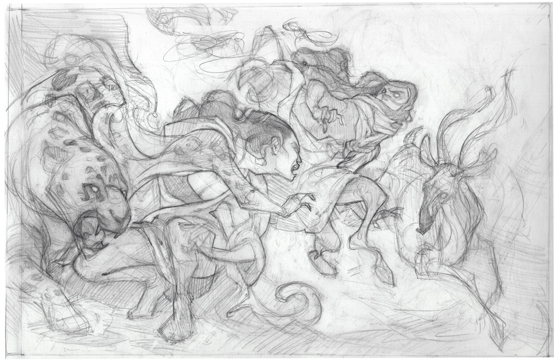
My favorite concept was developed a little further into a rough sketch (above)...
the drawing
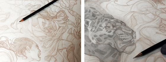
I wanted to build this painting with layers of transparent color that would allow the line art beneath to carry the piece - so I knew I'd need to start with a highly rendered pencil drawing that would leave very little to chance. I revisited my original sketch digitally - mainly to play with the scale of the figures and add some interest to the empty space that was overwhelming the background.
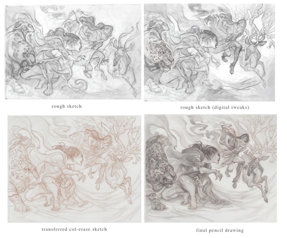
I transferred the adjusted sketch to the final surface using a lightbox and a brown Col-Erase pencil - using a tinted pencil for the initial lay-in of the final pencil art helped me nail down the details and work in a few last-minute changes before polishing the drawing with pencils, tissue blending, and a lot of work with a kneaded eraser.
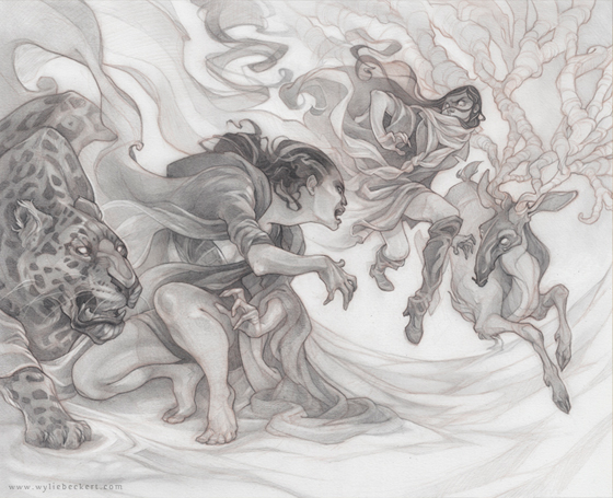
Finished pencil art (16x20" graphite on Bristol)
the underpainting
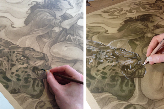
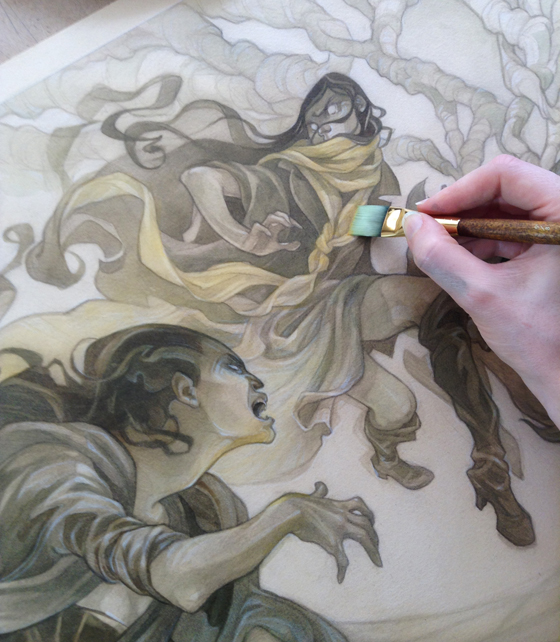
To preserve my original drawing, I used a large giclee of my pencil art - printed on tinted paper and mounted on illustration board - as the base layer. I gradually built up the values using diluted acrylic inks, then worked in highlights, accents, and tiny details using white charcoal and acrylic paint. I also began to add a hint of the colors that would appear in the final image.
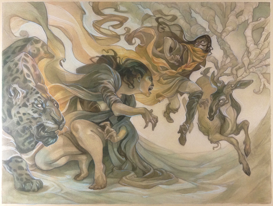
the oil painting
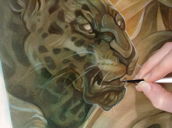
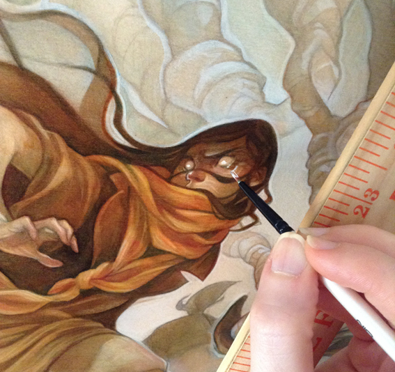
With the underpainting finished and sealed, I moved to transparent layers of oil paint to push the values even further and deepen the colors. While I mostly worked in thin, broadly-applied glazes at this stage, I also took the opportunity to touch up some of the lineart (which was beginning to get lost under the layers of ink glazes) with tiny brushes.
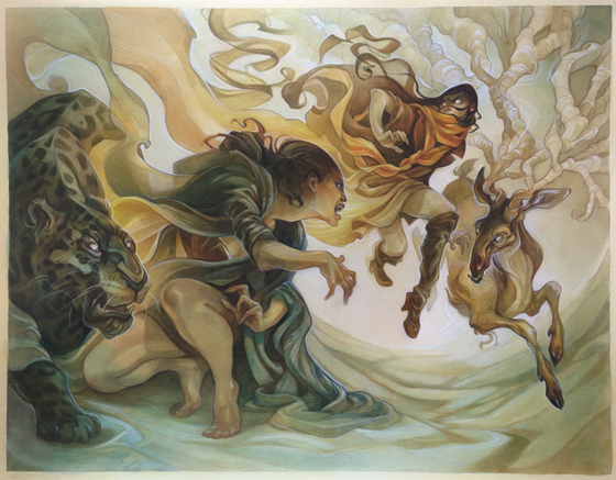
The first pass with oils - I found the colors a little too dull.
While I'd originally envisioned this as being a cool-toned, greenish-blue painting, it seemed to be missing something; a few glazes brought the piece around to its final gold-toned color scheme, and with a few touches of opaque white to bring back the highlights lost beneath the layers, I called it finished.
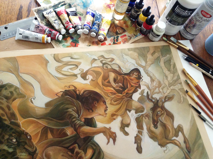
Pictured: the complete home Colder Wind assembly kit!