FOLLOW/SUPPORT
![]()
![]()
![]()
![]()
CONTACT: [email protected]
![]() JOIN THE MAILING LIST
JOIN THE MAILING LIST
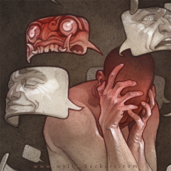
- MASKS -
ink & watercolor painting process
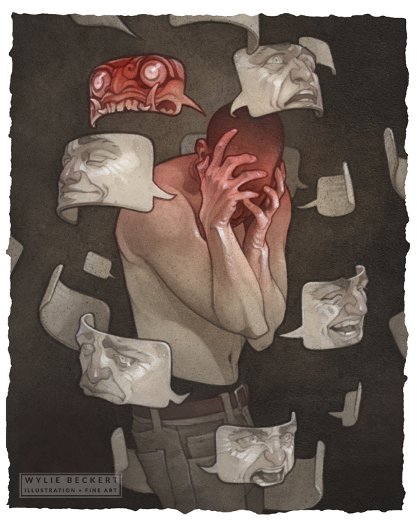
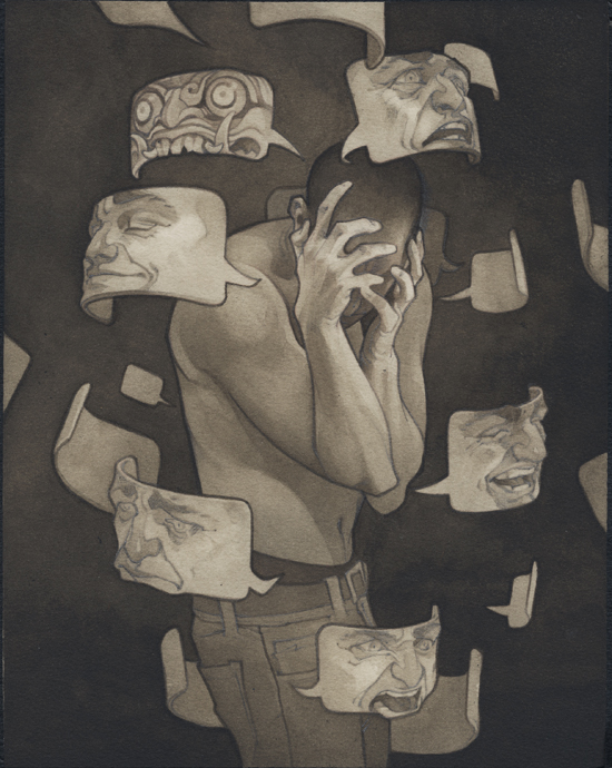
8x10" pencil, ink, watercolor, and white charcoal on Arches watercolor paper. Original SOLD.
Check out a video of the painting process below (be sure to click the gear icon to watch in HD!), and keep scrolling for more in-depth info on how I work. All of my process tutorials are made possible by my patrons on Patreon. Your support helps keep the tutorials coming - sign up below!
the concept
We take great comfort in the idea that within each of us, beneath the many masks we wear, is a kernel of "self" - something solid and unchanging that represents who we really are.
In actuality, our personalities are an ever-changing mirror of our circumstances; each of us is a mere change of scenery away from yielding to our better angels or inner demons.
the thumbnail sketch
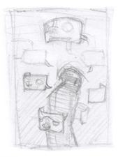
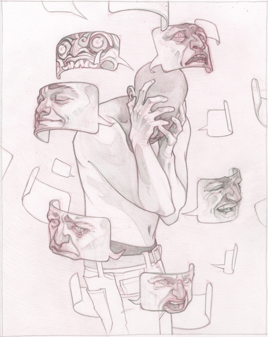
For this piece, I wanted to represent an ongoing struggle among the many facets of one character's personality, at the very moment at which one of them (the evil one, of course - did you really think the rest ever had a chance?) wins out against the others.
I pictured a single character, huddled in the center of a cloud of conflicting identities, covering their face; I wanted to give each identity a mask with a chat bubble shape - the format through which so many of our thoughts and intentions are presented to those around us.
INSPIRATION & PHOTO REFERENCE
I always like to take some reference photos before I get too far on a sketch - often I'll find much more interesting effects of pose or lighting than the ones I'd originally imagined. Normally I'll just take some cell phone photos of myself to get pose ideas, but this time I was lucky enough to have a fellow illustrator around to pose for me (artists make the best models, because they know how ridiculous a pose needs to feel in order to look cool as a painting).
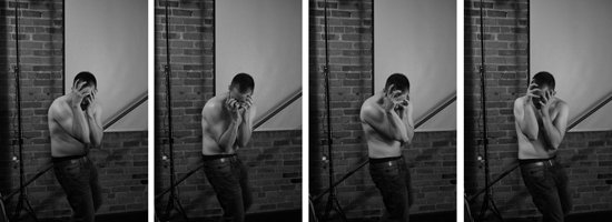
I took a few hundred photos, then picked my favorites and borrowed a little of each of them for my drawing. In my concept sketch, I'd imagined the main character with their back turned, but when I started taking photos, I realized that having him twisting towards the viewer was a much more interesting (and tormented-looking) pose; I also found some really cool lighting scenarios where the face was entirely in shadow (like a blank mask!) Case in point for photo reference...
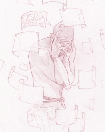
the drawing
Col-Erase; HB drafting pencil; Strathmore Bristol
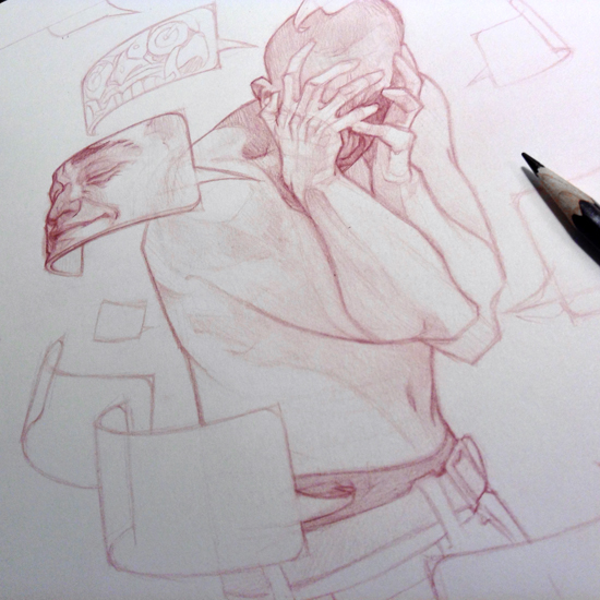
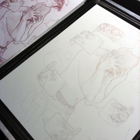
Since I know from experience that I'll do a lot of erasing and re-drawing before the piece looks just right, I use red Col-Erase pencil for my initial sketch - it's a bit softer and smudgier to work with than standard graphite pencils, and while mistakes can't be completely erased, their lighter color will be easier to camouflage underneath subsequent layers of graphite.
With the sketch nailed down, I begin the final pencil drawing. I work directly over the Col-Erase sketch: tightening up the drawing, adding fine detail and a sense of light and shadow, and building variety into the line weights within the piece.
Since I've made most of the hard decisions and major adjustments in Col-Erase, there isn't much erasing at this stage - I'm mostly just adding depth and emphasis to what's already there, which helps keep the finished drawing clean and sharp.
THE INK PAINTING
FW Acrylic Ink in Sepia and White; Liquitex Acrylic Ink in Carbon Black; Arches 90lb watercolor paper
I like to draw and paint on different surfaces (Bristol for drawing, watercolor paper or pastel paper for painting); however, it's easy to lose the energy of a drawing when it's transfered via lightbox, gridding, etc. Instead, I scan my drawing and print out a very low-opacity copy on my final surface (above right - in this case, Arches cold-press watercolor paper), dark enough to guide where my lines are going, but not so dark that the printed lines will show through in the final piece.
To keep the paper from buckling when it comes in contact with water, I wet-stretch my print before painting. I use a homemade paper stretcher (tutorial available here), which is pretty foolproof and a lot easier than the methods involving tape, staples, and other such diabolical instruments.
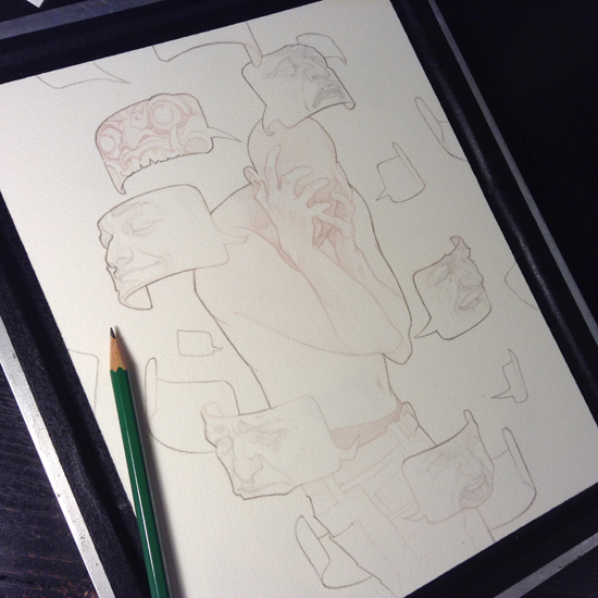
My first step once the paper is dry is to outline the entire figure in pencil - this will help guide me at the next stage...
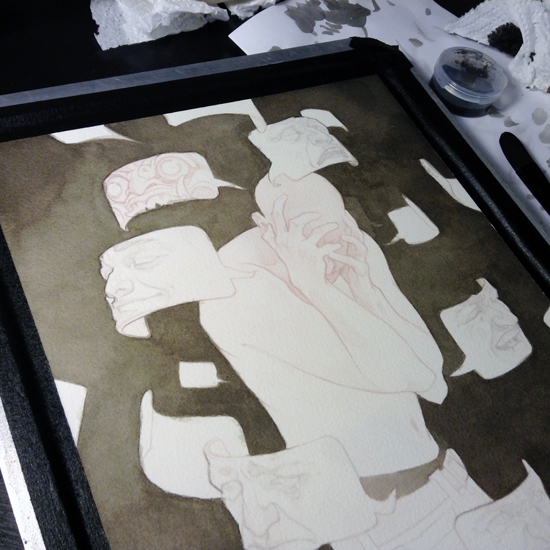
...which is filling in the background. While I generally like to start my paintings on a major focal point (faces, hands, etc) I'm aiming for a much darker final image than I'm used to painting. Since it's tricky to judge dark values against a white background, getting a head start on building up the near-black background will give me a reference point for what values to use on the foreground.
This is definitely the most tedious step - I build the tone up slowly in thin washes of diluted ink (a 75/25 mix of FW Sepia and Liquitex Carbon Black), letting the surface dry between layers. This gradual buildup helps fill in the "air space" of earlier layers, giving me an end result that's cloudy and fairly even, instead of patchy (like a more direct application of ink can be).
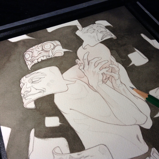
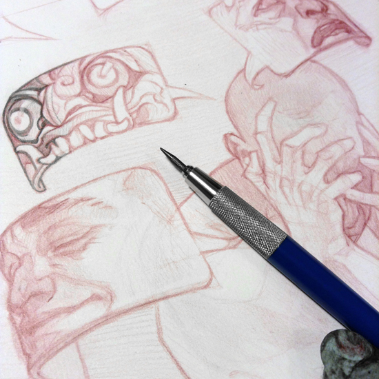
Next: more pencil drawing. This is a lot faster than my initial pencil drawing was - I'm basically just tracing the most important outlines and details, giving myself a guide for where to place the ink washes (since otherwise the print will be hidden by even the thinnest wash, leaving me flying blind).
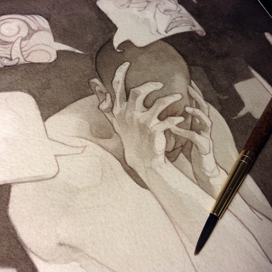
From there, I start building up the values in the main figures. Once again, I'm working in very thin washes of ink - it's better to sneak up on your values slowly than to put down a big blob of darkness in and ruin everything. Plus, the slow build keeps transitions soft and gives the piece a more naturalistic look.
I focus on finishing out the main character first - having his lights and darks in place will help me decide how light or dark the masks need to be.
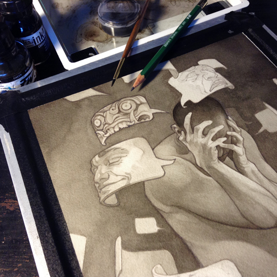
If you'd hoped I was done with the pencils, alas, I am not. I jump back and forth between ink and pencils a lot throughout the process - each layer of ink softens the pencil lines a little, which is great for areas that need some subtlety - not so much for bold graphic outlines.
Redrawing these areas brings back their strength, and also lets me tweak the shapes and lines as I go. I like being able to change my mind and make adjustments to the drawing mid-painting. I go through as many rounds of pencil/ink/pencil as I need to in order to get the right balance of ink values and pencil details.
COLORIZING
Liquitex Acrylic Ink in Naphthol Crimson; FW Acrylic ink in Sepia
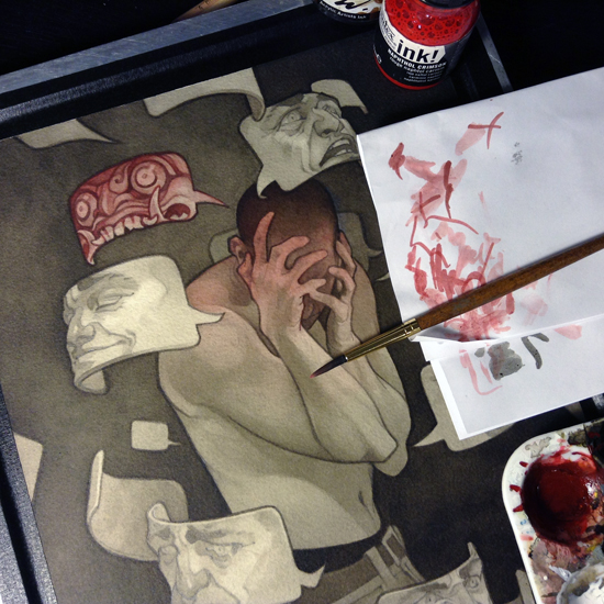
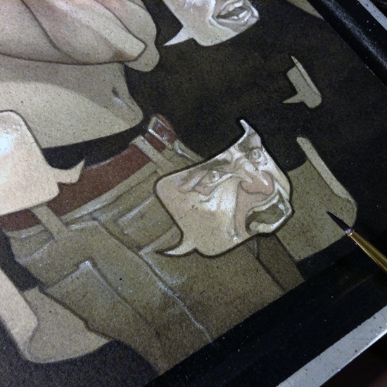
I wanted to visually link the demon mask and the main character, so that they would jump out at the viewer first amongst all the other visual noise. I chose to do this through a bright spot color on just those two elements.
Watercolor was my weapon of choice to begin with, but I realized that when dry, it was way too subtle (the layers of ink underneath it really killed its vibrancy). Acrylic ink, being a little bit more vivid and opaque, turned out to be a better solution. I applied a very thin wash (a mix of Liquitex Naphthol Crimson and FW sepia) to the mask and main character, blending the edges with water for a soft transition down the figure. Once dry, I went in and painted over some of the pencil lines (especially in the mask) with a more concentrated mix of red to further set them apart from the monochromatic parts of the painting.
WHITE CHARCOAL PENCIL
General's Charcoal White
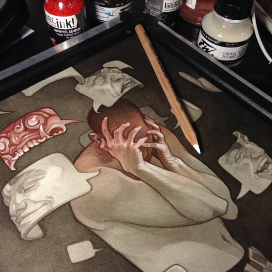
Once dry, I add some highlights with white charcoal pencil. Since I've been slowly pushing the piece darker and darker, the white charcoal stands out really nicely against the duller surface. I have to make sure I'm adding highlights sparingly - it's easy to get overexcited and make everything uniformly bright at this stage, which can kill the contrast of the piece.
FINISHING TOUCHES
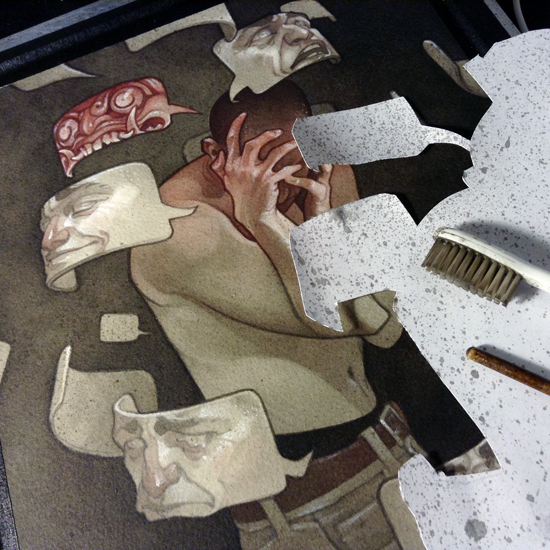
I like to add a little bit of randomness and texture to the finished painting; running a brush handle along the bristles of a toothbrush dipped in (very diluted) black or white ink is a great way to create a mist of fine splatters.
To control where the splatters are going (I want more of them in the background, less of them on the character and masks) I trace the major shapes on a sheet of printer paper and cut out a stencil; this lets me mask off areas, and direct the splatters exactly where I want them.
The ink splatters are subtle, but they have the effect of softening the lines of the piece. In areas where the contrast is really important - like the outlines of the masks - I retrace the lines in ink.
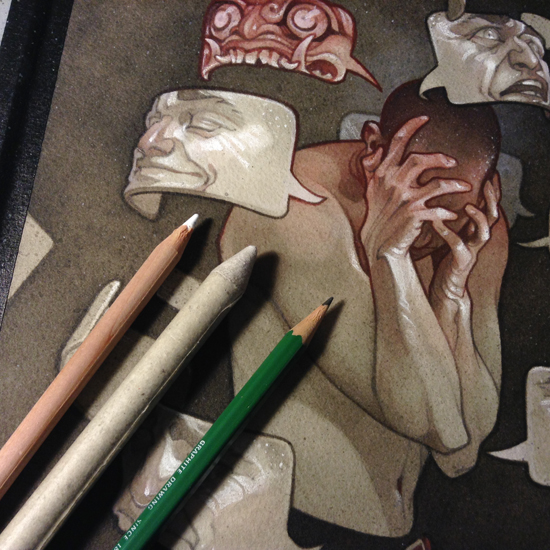
The very last step is one final pass with pencils and white charcoal - I'm touching up any details that may have gotten lost amongst the splatters, but I'm also playing around with the image a little now that I know the finishing line is near. I'm hunting around for interesting shapes and lines that I can play up with subtle pencil touches (like the neat curves on the wrists and hands) and seeing what I can do to add fun details to the close-up read of the piece that won't interfere with its overall value structure and impact.
My very last step was to scan the painting, and make a few tiny adjustments in Photoshop - most notably, deepening the red on the demon mask and main character. I really like the look of this, so I'll probably end up sealing the original painting with matte medium and adding a similar effect in oil paint (I'll update this tutorial if/when I get around to that!)
IN CONCLUSION...
I'm somewhat new to this process (I've been working primarily with mixed media/oil for the past few years). With ink painting, I'm finding that it's a little less cut-and-dried as to WHEN a painting is finished (I actually think the pre-white-charcoal stage on this one was my favorite - but could it count as "finished?").
I'm hoping to keep experimenting with this - seeing how much (or how little) I need to put into a painting for it to feel complete. If you want to follow my twisted experiments (and check out more process tutorials) you can support my art on Patreon, link below: